UI & UX Design
Optym HaulPLAN Improvements, 2015-2016
Under the direction of Sam Ahuja, we made a series of improvements to the user experience and interface of an Optym application for the trucking industry.
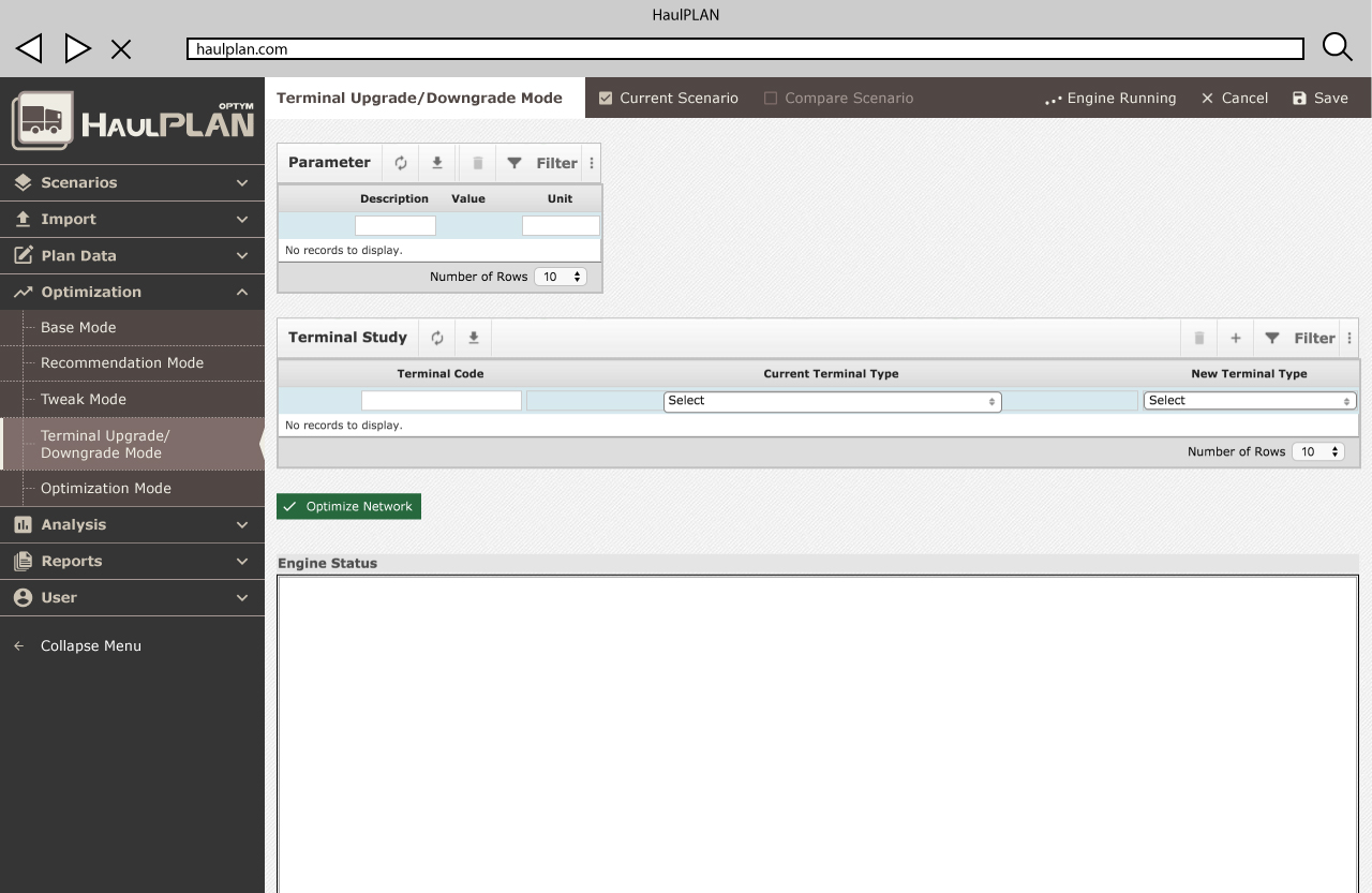
I updated the menus, icons, and forms to meet the principles of Google’s Material Design within Optym branding standards. We also made improvements to meet accessibility requirements and increase usability.
Made with Photoshop, Illustrator, InDesign (Adobe CC 2015), CSS
Overall Improvement


Left Menu Project

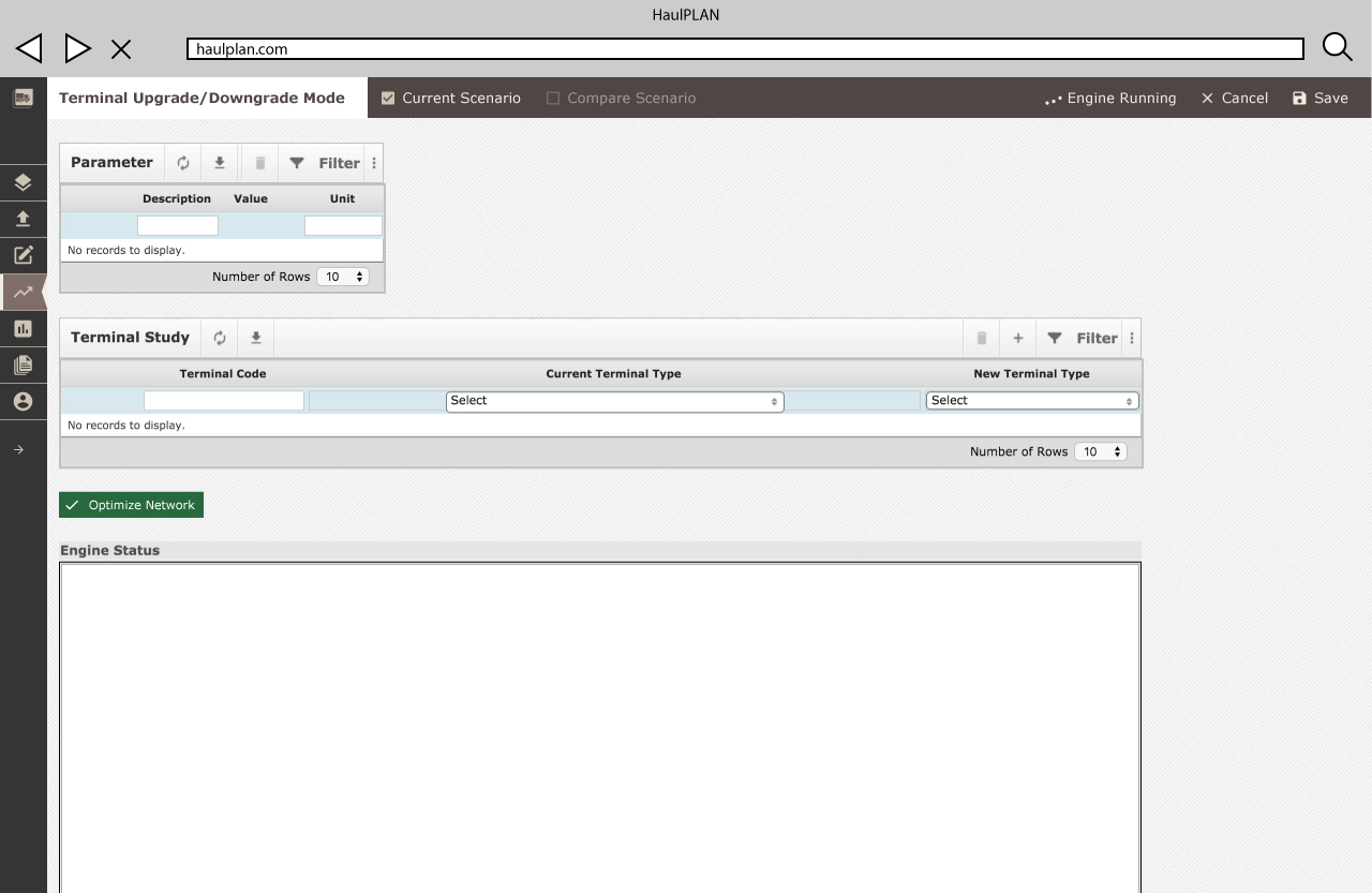
Optym’s HaulPLAN application was initially built in 2007. HaulPLAN assists trucking companies in the creation of schedules and routes to save time and money. When I joined the project in 2015, the application required many changes to improve consistency throughout. Towards the end of 2015, we were able to begin incorporating concepts of responsive design to the application as many of the users were on older, low-resolution desktops.

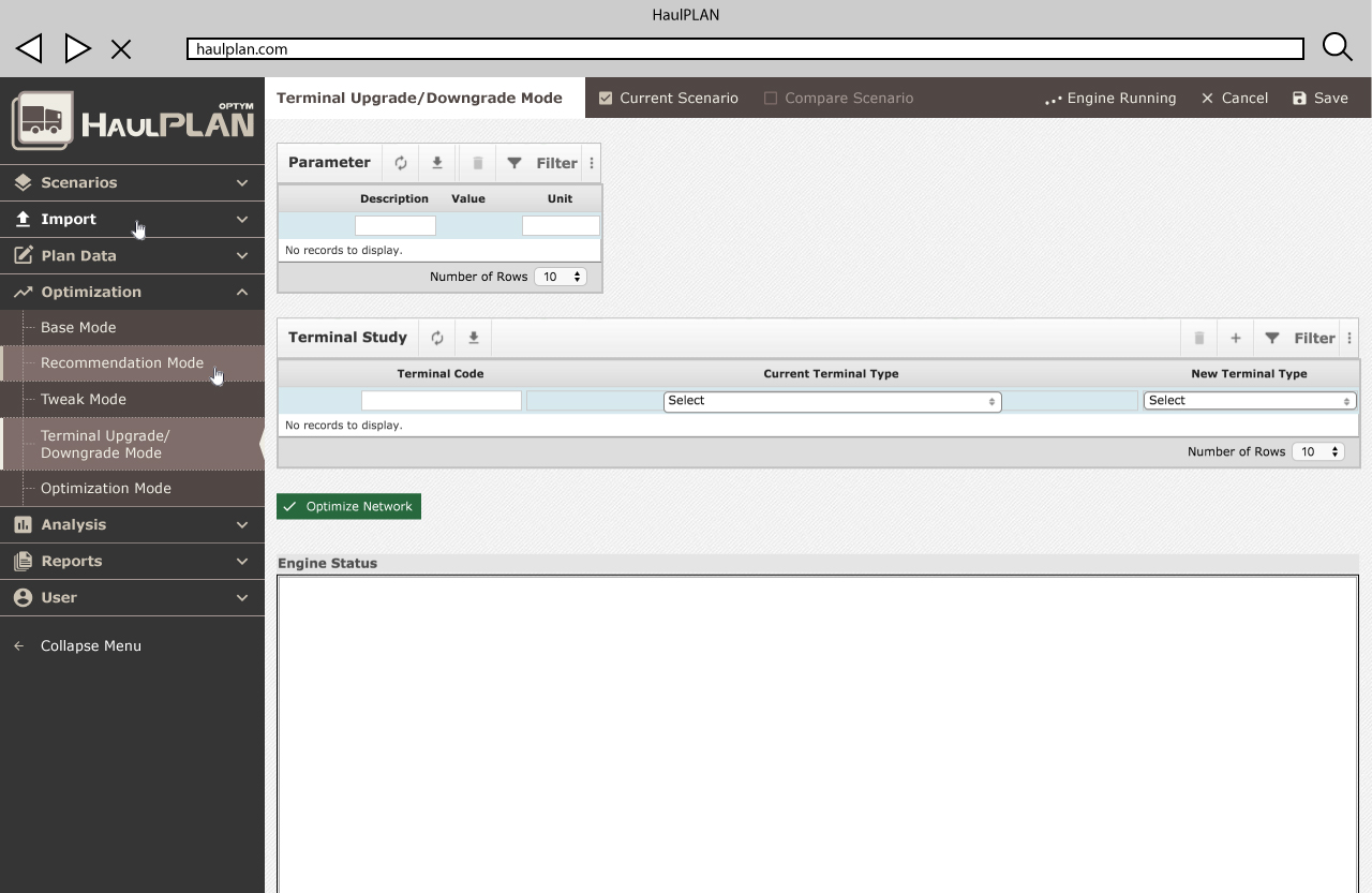
The navigation structure was identified as the first obstacle toward creating a flexible application. The menu’s wide, drop-down, two-tiered structure caused confusion for users. The development team was eager to transition to a cleaner design.

It was recommended that we shift the design to a collapsible left menu like the one used in Optym’s Viewr project.
Given the complexity of this change and it’s potential to require the redesign of the application as a whole, thorough documentation was required. I wrote out what further designs the transition to a left menu would require in a detailed Jira issue. I also listed the open Jira issues that this change would nullify.

I then began the design process with wireframes created in Illustrator to explore the structure of a left menu in the context of the application. The application’s top menu had multiple levels and divisions of content with optimization and scheduling links in the left area and all other links and controls in the right. With the new left menu, the majority of this content was required in a single column.

With the navigation moved to the left, the interactions available within each page became clearer. These interactions allow the user to save or cancel changes as well as compare various scenarios within the page, which is critical to creating optimal schedules. I created iterations of this design to test how best to arrange these controls for ease of use.

For the next stage of designs, I was asked to create pixel perfect mockups. In these mockups, the icons, colors, and page contents were updated according to in-progress designs for other edits to the application such as improving button, overlay, and data grid UI.
Through iterations in this detailed design, the creative director, project manager, and I decided on the organization of in-page interactions, icons, and the start of adjusting layouts for each page of the application.


