2021
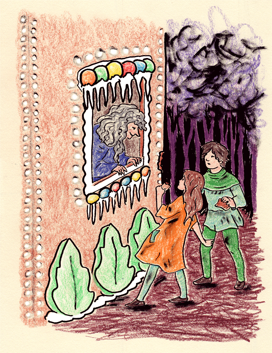
Hansel & Gretel
Color Theory, Historical Art Research, Layout Design, Narrative Illustration, Narrative-Driven Design, Typography
I conceived this as a passion project to merge my love for childhood fairy tales with my professional focus on storytelling through design. In early 2021, I set out to illustrate and fully lay out a version of Hansel and Gretel, aiming to flex my skills in historical art research, color theory, typography, and hand-drawn illustration. My main objective was to frame the morbid charm of the original tale without relying on full-page scenes, instead weaving smaller, detailed vignettes into a cohesive layout. Over five weeks, I dedicated three days each week to the project, carefully balancing it against freelance commitments and a job search.
Made with Adobe InDesign CC, Adobe Photoshop CC, colored pencils, ink
The Process
I began by sourcing a public-domain text of Hansel and Gretel and collecting visual references that evoked early 20th-century children’s books and 19th-century European folk art. I found that having few full-page illustrations and relying on open-source references challenged me creatively. Exploring various media including digital sketches and watercolors, I ultimately settled on colored pencils for their tight palettes and tactile warmth. I layered separate ink drawings to add to the print-making feel, tying the book further to pre-digital means of book printing. Throughout, I validated my assumptions by iterating layouts, sleeping on decisions, and letting the “right” compositions emerge after reflection. I was the sole decision-maker but occasionally ran the trickiest puzzles past my husband to vocalize sticking points. My decisions hinged on what felt most authentic to the story’s dark whimsy and my rough-edged, DIY aesthetic.


The Outcome
I successfully produced a complete cover-to-cover layout that I could proudly share publicly. Meeting my goal of working three days per week for five consecutive weeks ensured steady momentum and work–life balance. The project sharpened my narrative illustration skills and deepened my expertise in brand-building through research of period-appropriate fonts and imagery. After years of in-house brand work, this self-directed exploration broadened my visual vocabulary, energized my freelance practice, and bolstered my confidence—opening doors to richer portfolio opportunities and client inquiries.


Related Projects