2021
FinTech App Emails – Templates and Newsletter
Accessibility Design, Art Direction, Brand Design, Illustration, Layout Design, Marketing Design, Photo Sourcing, Visual Systems Design
As Senior Digital Designer overseeing all marketing design for the fintech startup Firstly, I partnered with the Content team and Product Design to reimagine the email ecosystem during the relaunch of the Honeyfi app as Firstly. The company was focused on helping families budget together more easily, offering tools to simplify financial planning and reduce stress around money management.
The project began with a reset of product emails and quickly expanded into a full newsletter redesign. Working alongside co-founder Sam Schultz, Senior Product Designer Tony Bucher, and the Content leadership team, I established a streamlined, dark‑mode‑ready template system that balanced speed of build with brand consistency. Over ten weeks, these templates became the backbone of our communications, enabling the startup to present itself with greater professionalism in the lead‑up to relaunch.
Made with Figma and Adobe Illustrator CC
The Process
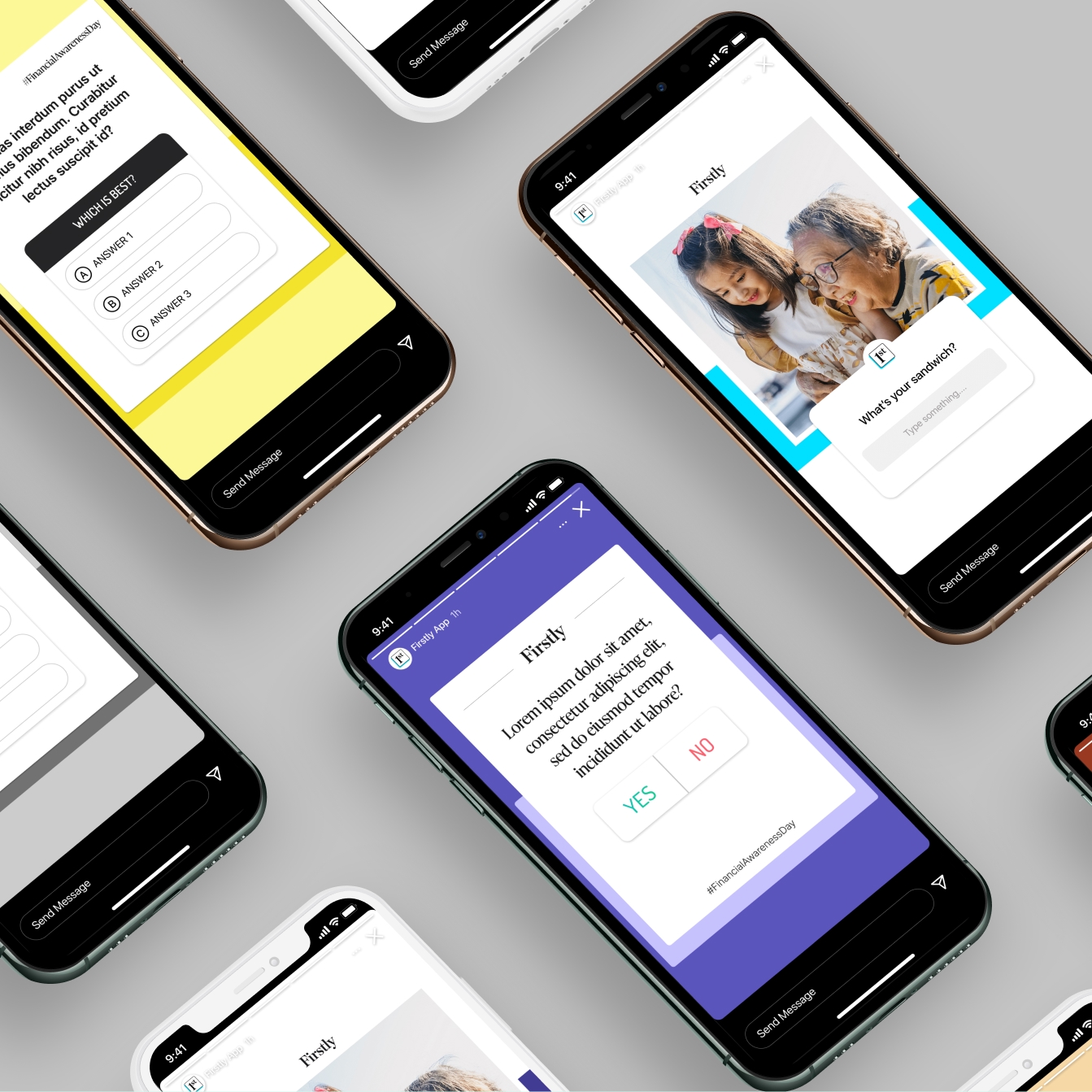
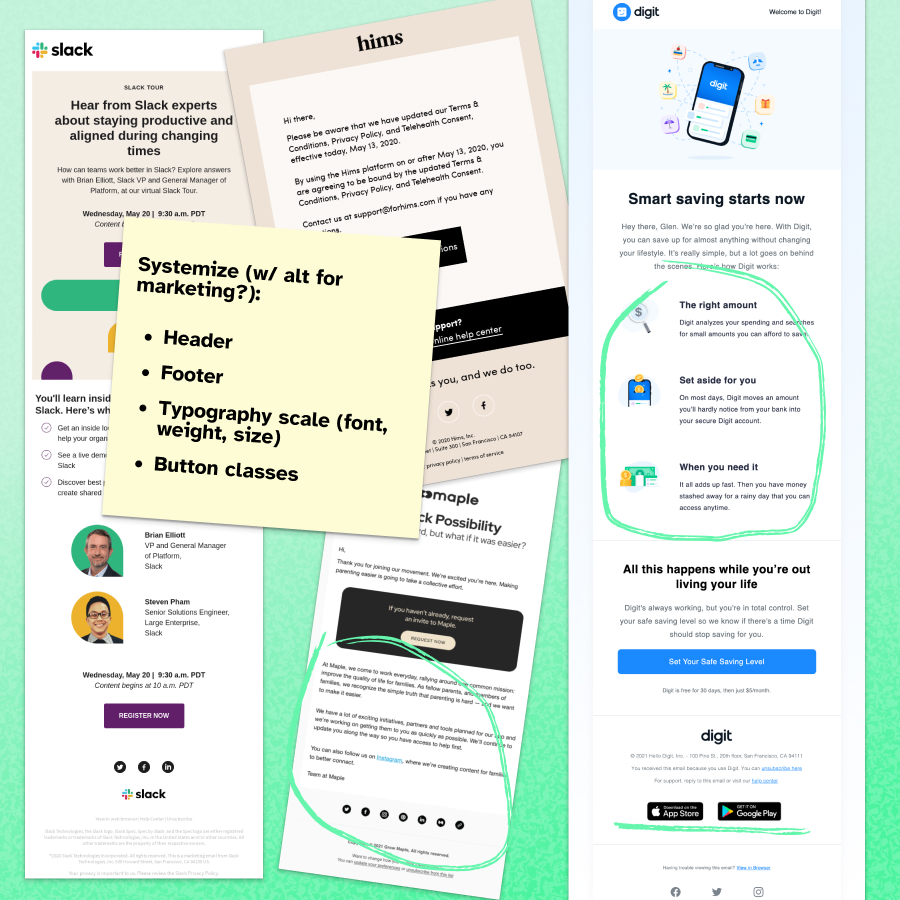
After a quick clean up of The project kicked off with a working session between Sam Schultz, Tony Bucher, and myself to review existing Honeyfi product emails and an early draft in the new Firstly brand. While my initial explorations pushed graphic treatments and layout variety, we quickly aligned on the need for a Phase 1 “low‑lift” build that could be executed immediately, with Phase 2 designs reserved for when development resources freed up.
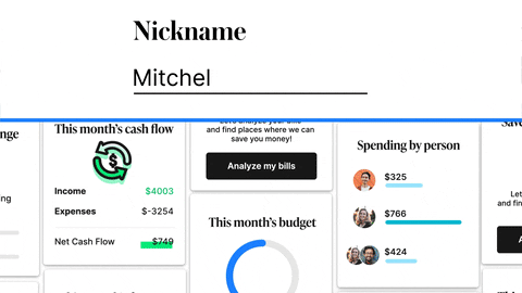
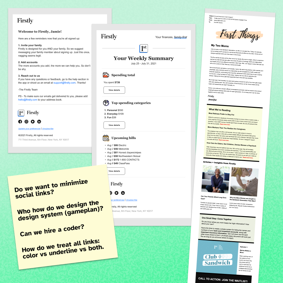
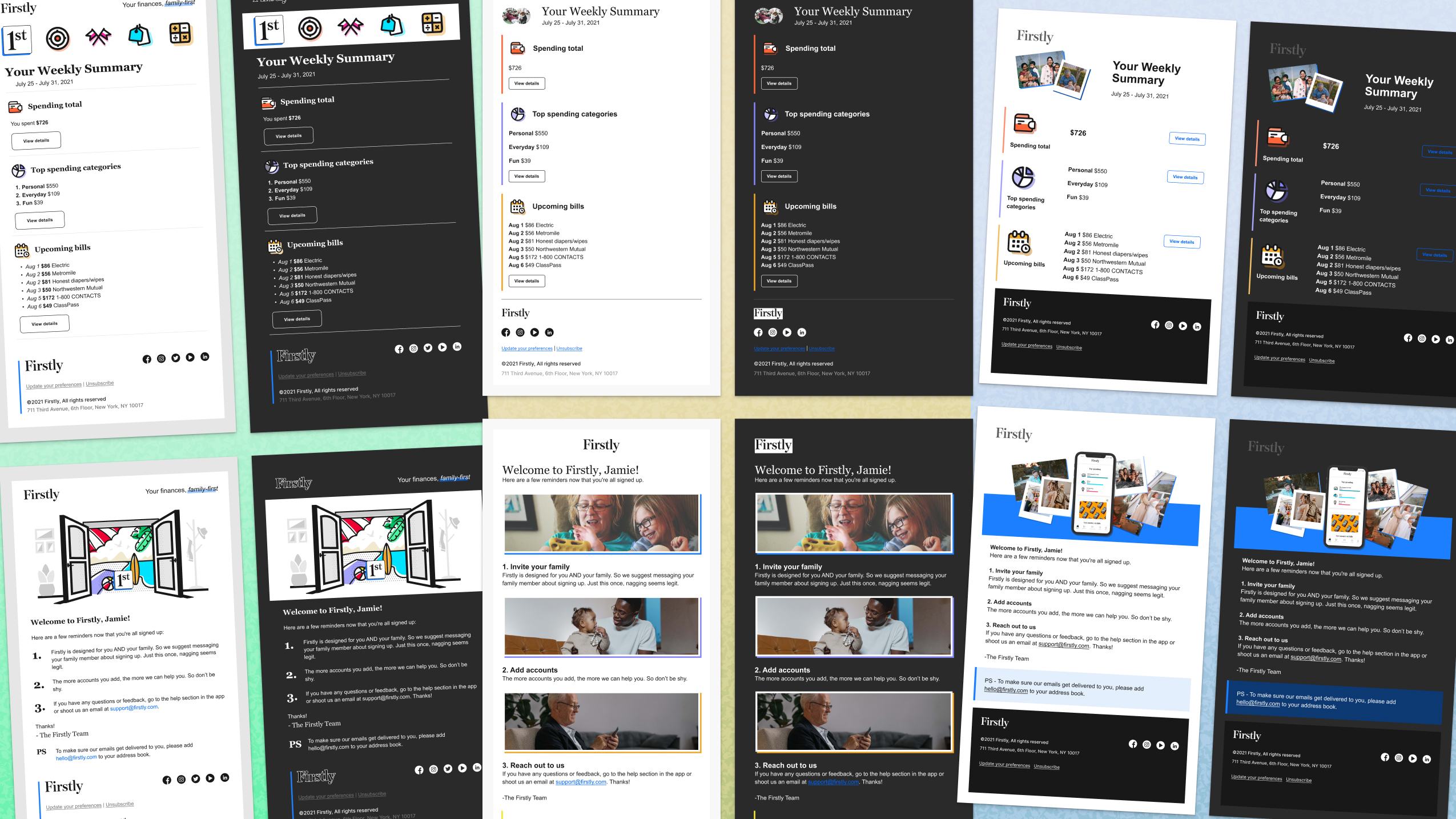
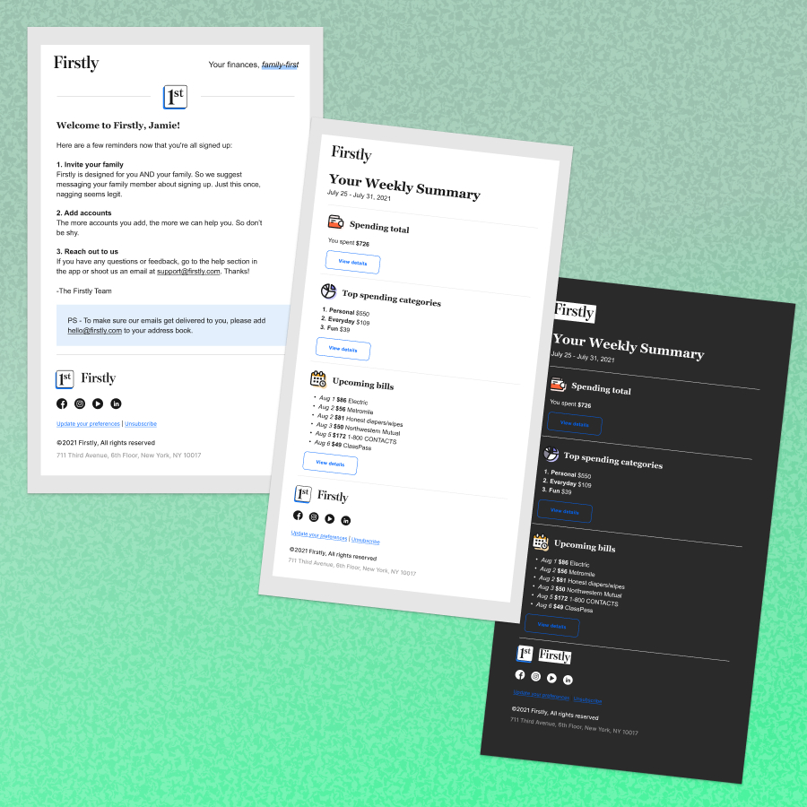
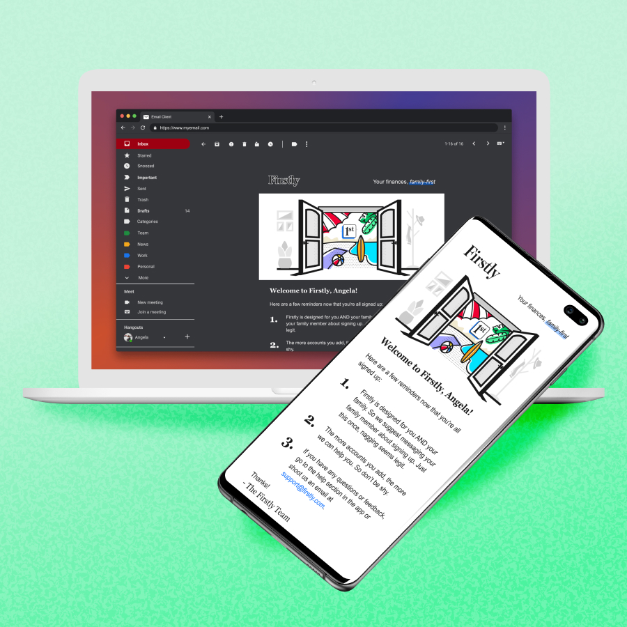
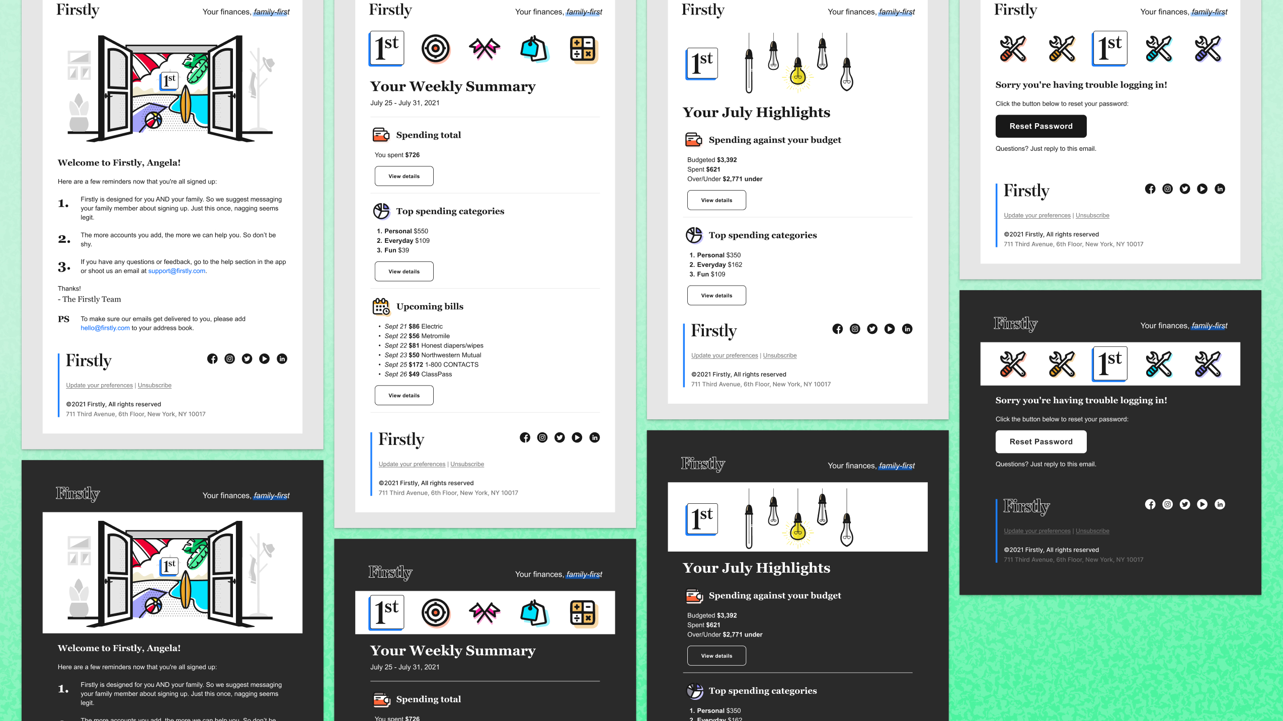
I created baseline templates for the welcome series, weekly and monthly statistics, and error emails, drafting multiple concepts that balanced illustration and photography. Drafts were shared in Figma, with feedback exchanged through Slack, quick video calls, and daily stand‑up style reviews.
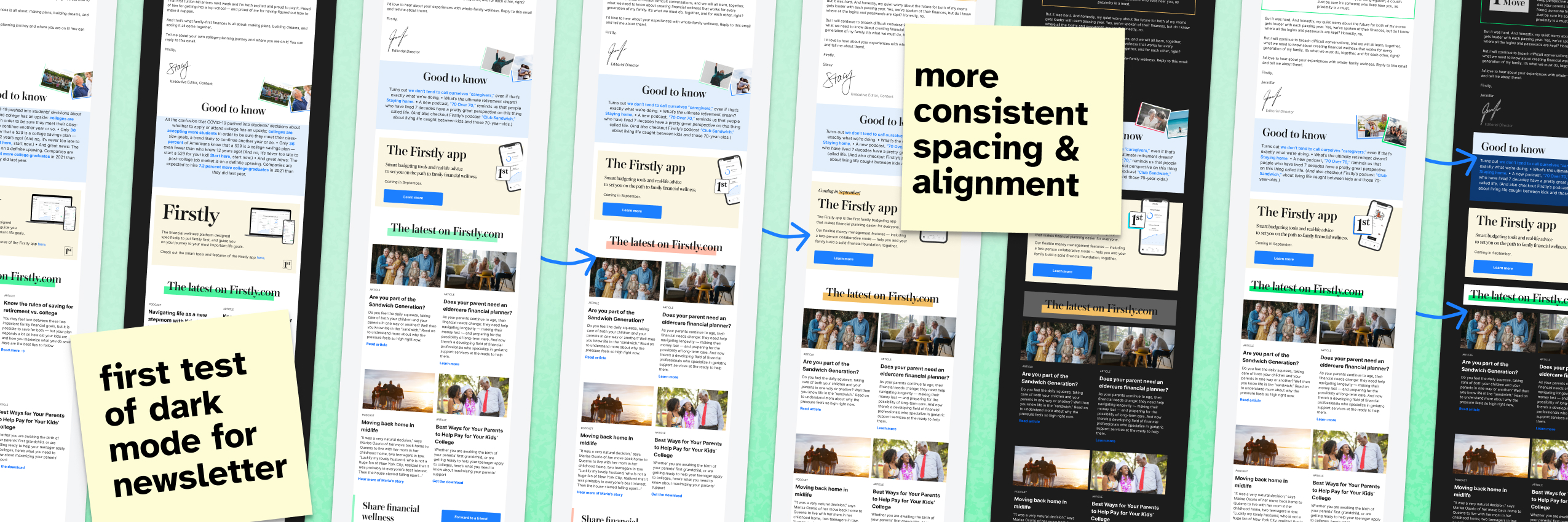
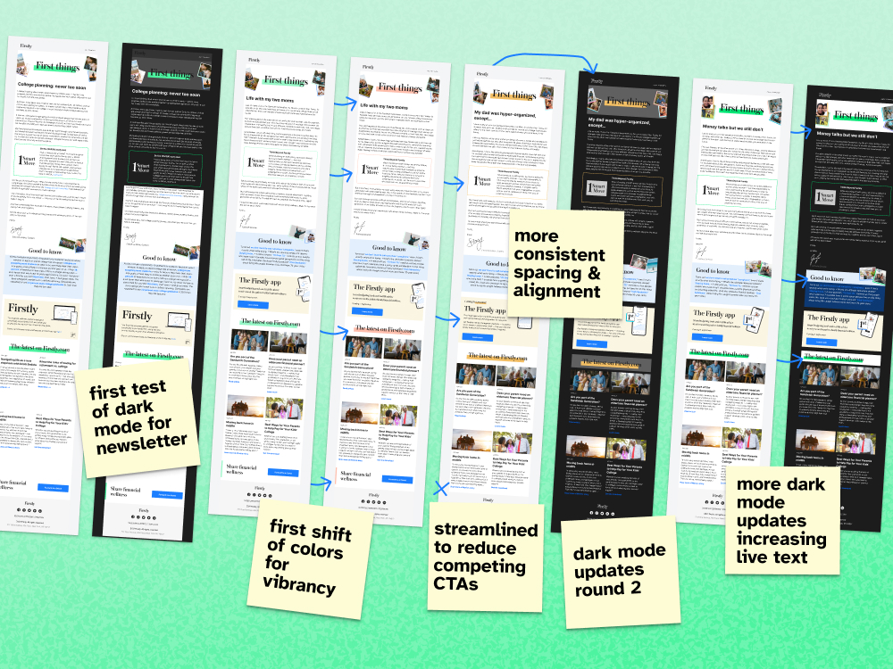
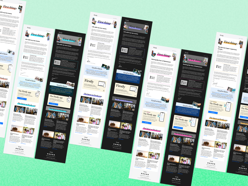
Once the product email structure was secured, I proposed extending the same refinements into the weekly newsletter. Jennifer Owens and Jessica Torres Cooper provided weekly sign‑off on newsletter content, while Tony ensured brand alignment. Iterations were fast and collaborative: copy arrived via Google Docs, I posted Figma drafts in Slack, and feedback flowed openly across channels. Assumptions about live text, minimal graphics, and dark‑mode readiness were validated through Stripo’s testing tools and extensive QA across devices. Week by week, I refined layouts for lighter builds, faster load times, and smoother workflows. To support consistency, I built a SharePoint image library of curated, on‑brand stock pulls for the Content team.
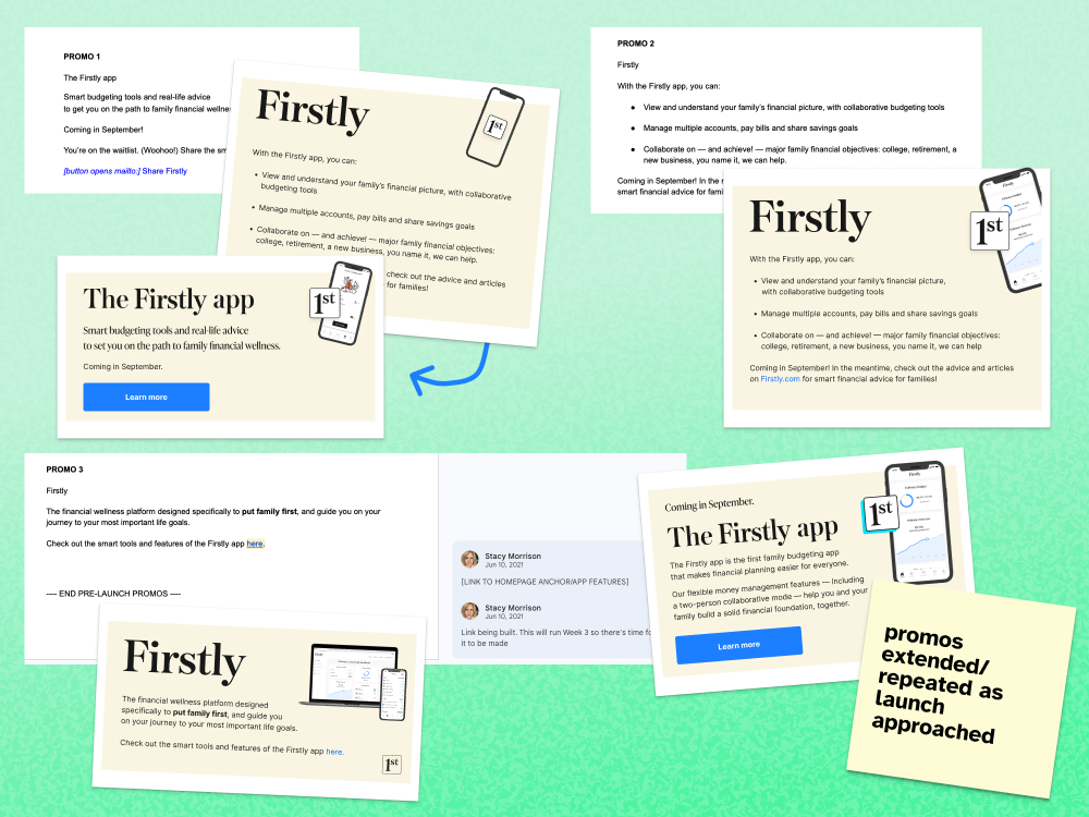
Working closely with the content team, I drafted a series of designs for promos to boost interest in the app launch as the big day approached.
Week to week, while the promo changed, I also refined the structures and details of the newsletter to make it cleaner, lighter, and easier to rebuild.
The Outcome
Across ten weeks, we shipped a consistent stream of newsletters and product emails that steadily improved open rates and performance. The streamlined templates reduced build complexity, saved time, and ensured accessibility, while the curated image library reinforced brand cohesion. By balancing immediate needs with longer‑term design goals, the work elevated the professionalism of the startup’s communications and strengthened brand consistency across all outputs. In the critical period leading up to relaunch, these improvements positioned the company to engage its audience with clarity, trust, and polish.

Related Projects