Branding & Email Design
Firstly Email Templates, 2021
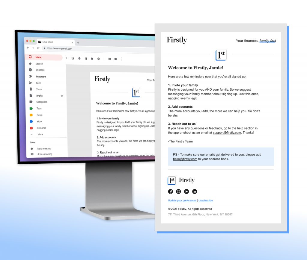
With the upcoming launch of Firstly, a revamp of the Honeyfi app to focus on family budgeting, a series of email templates were needed to reflect the new brand.
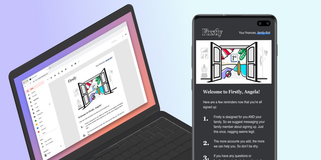
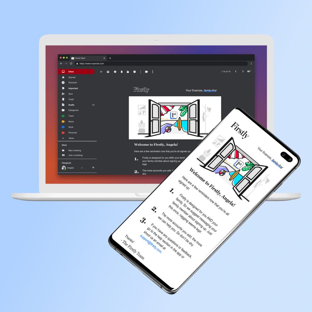
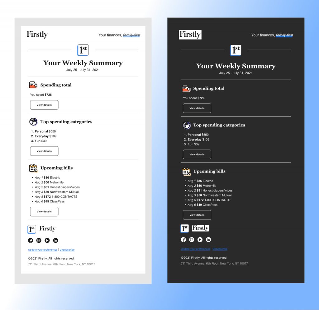
The primary goal of this revamped email series was that they be easy to build in our WYSIWYG email template builder, Stripo. They also needed to be dark mode friendly from the beginning. With previous email series, this had been a fix further down the line, so it was crucial to save time up front.
I set the following priorities to maintain an easy build:
First, use live text only in a system friendly font. Previous efforts to hold on to the brand fonts resulted in image heavy builds and we wanted to avoid that for many reasons.
Second, use only low-lift graphics that would be built from existing brand illustrations and made once for each email type.
Third, with limited time and development resources, the less custom coding and troubleshooting the better.
This was a very swift project: drafts were begun on a Friday, pitched the following Wednesday, refined during the pitch, and ready to be built on Thursday.
Made with Figma and Adobe Illustrator CC
Initial Concepts
Starting Friday, working with the Product Designer, Tony Bucher, I created initial 3 options with varied components.
Option 1
Outline logo for dark mode, illustration-focused header graphic, strong scales to set hierarchy of text, split column footer.
Option 2
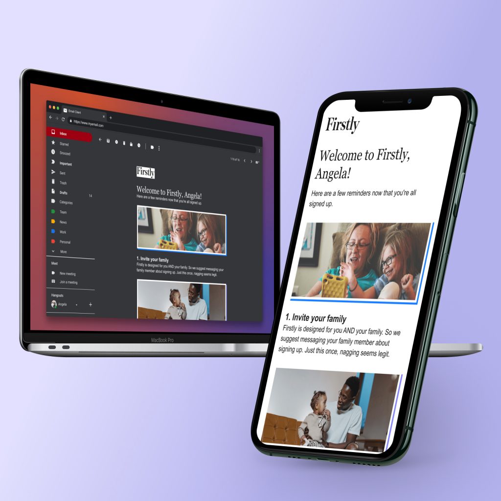
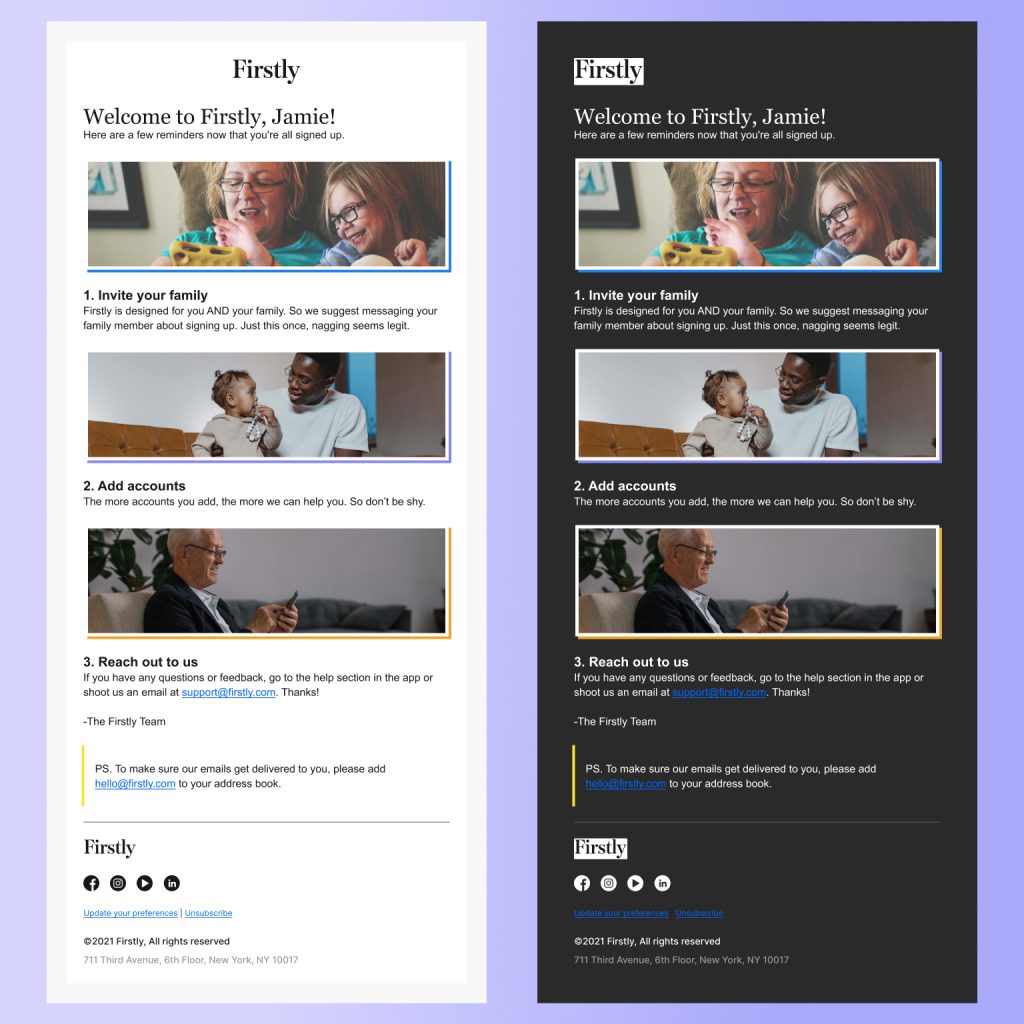
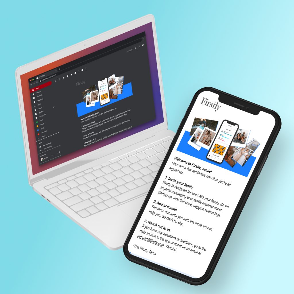
Solid background for dark mode logo, headers with optional photography, font weights to define text hierarchy, single column footer
Option 3
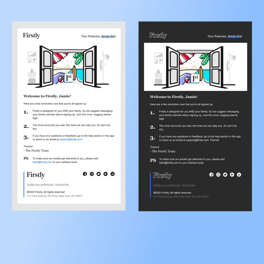
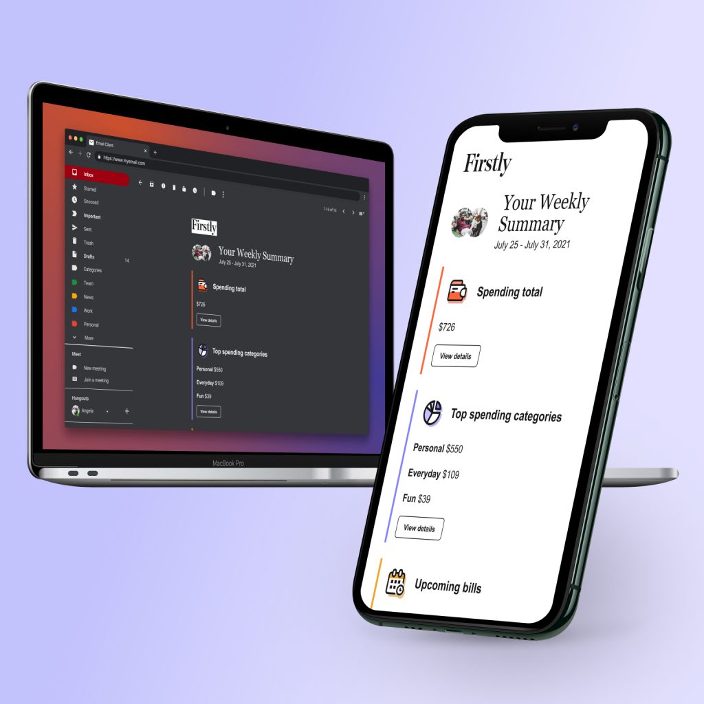
Mid-gray top logo, App + photo illustration header, balance of weight and scale text hierarchy, always dark mode footer
Reduced Lift Options
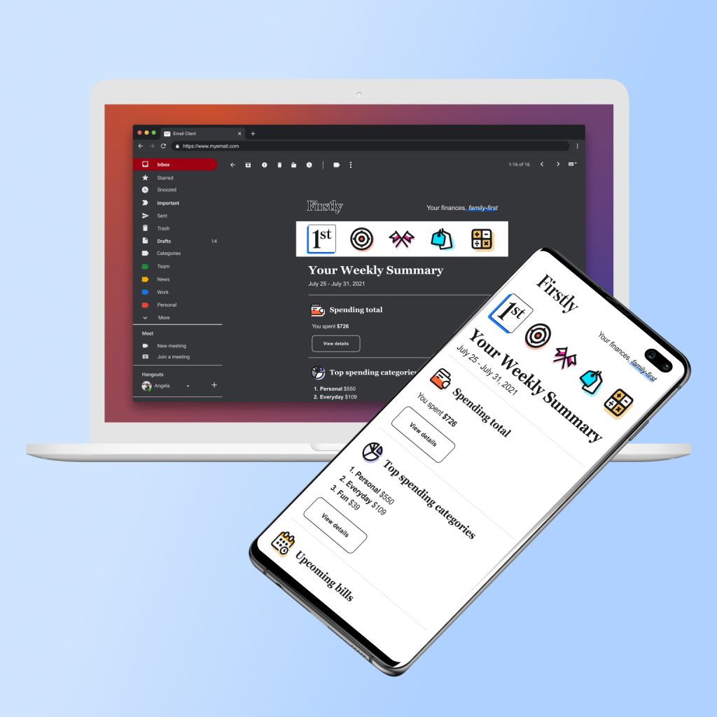
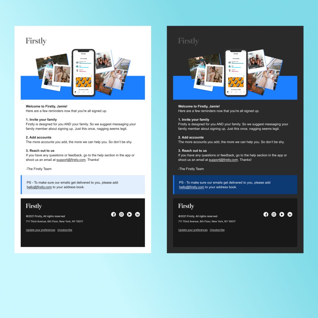
With feedback from marketing and product directors, I further simplified two additional options to create the lowest lift version with “reach” elements that could add more interest to emails as build time allows in future. The app icon was added to the footer and I aimed to keep any small pop of color feasible to hold user attention.
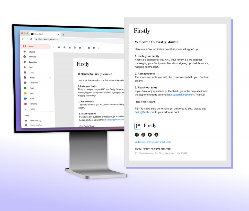
“Clean” Option
The two column header with tag line is retained here, recognizing that would need testing and troubleshooting to keep it clean and legible on mobile. A banner image is also retained, with similar efforts required. An easy color addition, though, is the callout background in certain series.
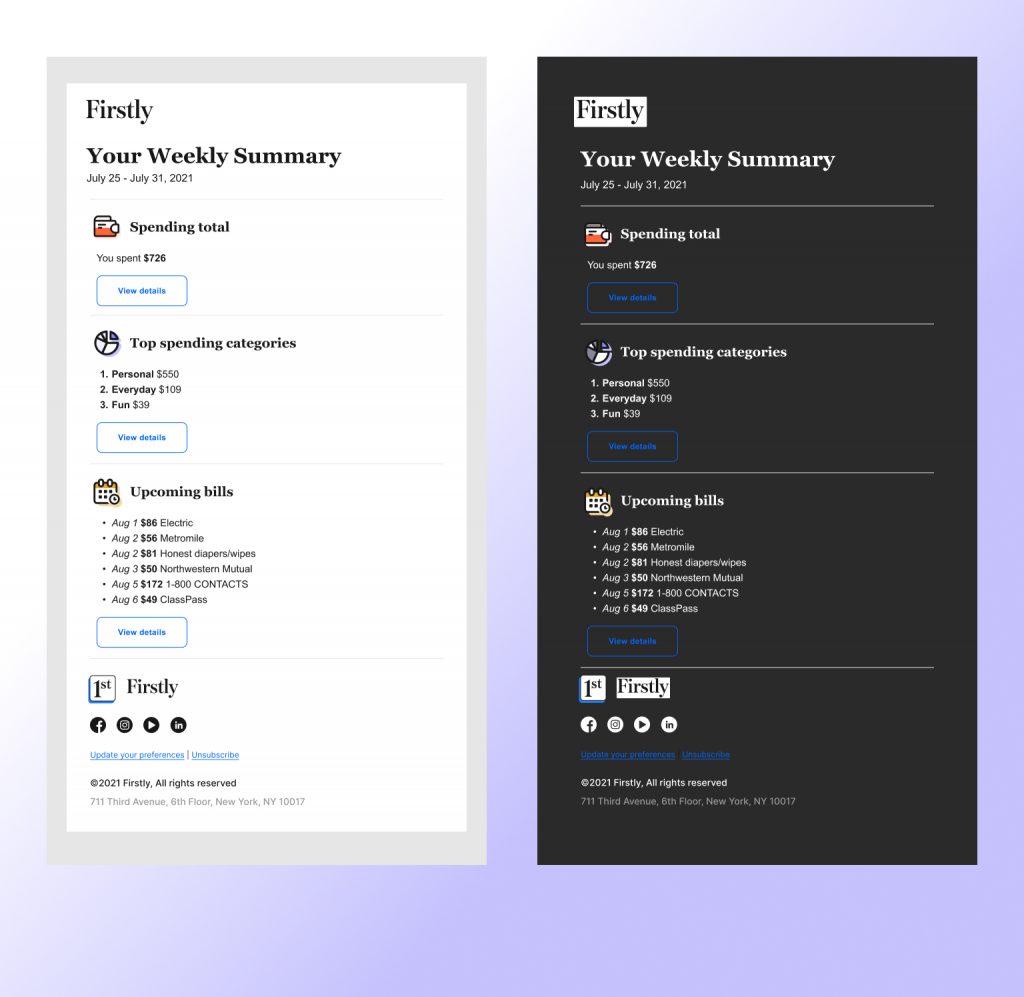
“Cleanest” Option
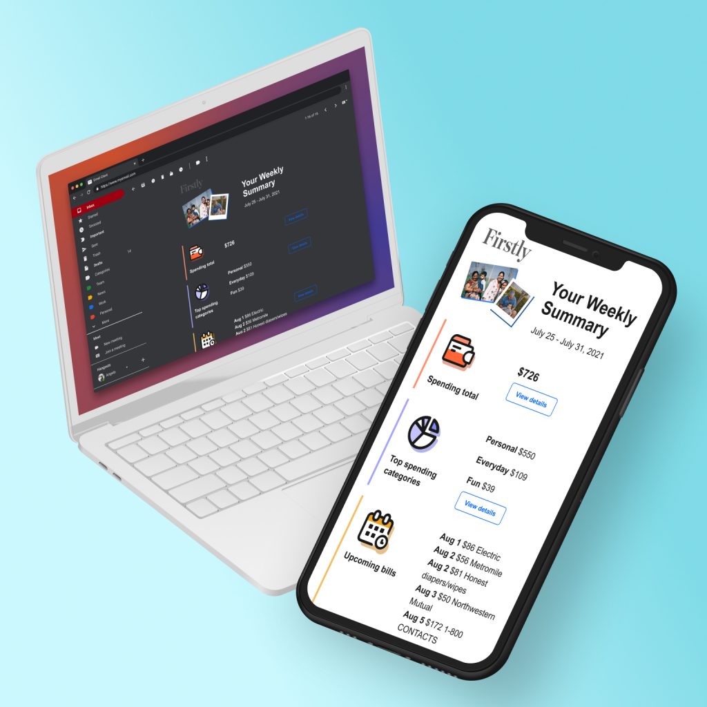
Stripped down to logo only header and no banner image. Color is added to links and buttons to keep a small splash of intrigue.